Gadgets
Color
- Beige 1
- BlackBlack 216
- Black/Blue 2
- Black/Gold 2
- Black/Green 1
- Black/Grey 1
- Black/Red 1
- Black/White 2
- BlueBlue 73
- Blue/Red 4
- Blue/Yellow 2
- Brown 4
- Dark Blue 3
- GoldGold 16
- Green 23
- Grey 16
- Light Blue 4
- No Color 223
- Orange 27
- Pink 32
- Purple 11
- Red/Blue 1
- Red/White 2
- Rose Gold 1
- SilverSilver 21
- WhiteWhite 75
- Yellow 12
- γαλάζιο 5
- Κόκκινο 46
- Μπεζ 9
Το προϊόν “Φωτιζόμενο λουράκι σκύλου γαλάζιο medium -100174” έχει προστεθεί στο καλάθι σας. Καλάθι
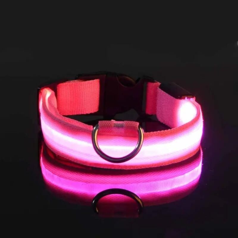
Φωτιζόμενο λουράκι σκύλου ροζ medium -100224
Φωτιζόμενο λουράκι σκύλου ροζ small -100214
Φωτιζόμενο λουράκι σκύλου ροζ xsmall -100204
Φωτιζόμενο λουράκι σκύλου γαλάζιο xlarge -100194
Φωτιζόμενο λουράκι σκύλου γαλάζιο large -100184
Φωτιζόμενο λουράκι σκύλου γαλάζιο medium -100174
Φωτιζόμενο λουράκι σκύλου γαλάζιο small -100164
Φωτιζόμενο λουράκι σκύλου γαλάζιο xsmall -100154
Online store of household appliances and electronics
Then the question arises: where’s the content? Not there yet? That’s not so bad, there’s dummy copy to the rescue. But worse, what if the fish doesn’t fit in the can, the foot’s to big for the boot? Or to small? To short sentences, to many headings, images too large for the proposed design, or too small, or they fit in but it looks iffy for reasons.
A client that’s unhappy for a reason is a problem, a client that’s unhappy though he or her can’t quite put a finger on it is worse. Chances are there wasn’t collaboration, communication, and checkpoints, there wasn’t a process agreed upon or specified with the granularity required. It’s content strategy gone awry right from the start. If that’s what you think how bout the other way around? How can you evaluate content without design? No typography, no colors, no layout, no styles, all those things that convey the important signals that go beyond the mere textual, hierarchies of information, weight, emphasis, oblique stresses, priorities, all those subtle cues that also have visual and emotional appeal to the reader.


